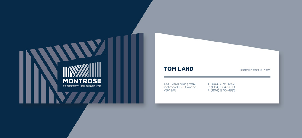
MONTROSE PROPERTY HOLDINGS LTD.
Branding and Stationery – Montrose is a parent company that owns a waste management and recycling company in the lower mainland. Once the landfill is full they are building a warehouse facility on top that will be powered by the brown energy released by the decomposing waste.
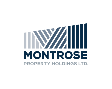
The brand represents the energy rising upwards and through the building, growing with strength from a strong family foundation. The bold blue lines give a nod to the family tartan of their ancestral village Montrose, in Scotland.
Created at Cossette Communications Vancouver
CREDITS
Samantha Leigh Smith – Art direction and design

ALTERNATE LOGOS:
These alternates are to be used as a lock-up with current and future Montrose sub-brands.